Friday, June 27, 2014

Gaming Gifs

Quick Disclaimer:  These Gifs come courtesy of a blog page dealing exclusively in obscure video game media.  Here's a link, and a small sample for your viewing enjoyment.

Green-Blooded Kunoichi vs. Samurai Leatherface

I kid you not when I say the name of this game is "Chuck Rock"
Woah!  Is that Ted from Bill and Ted's Excellent Adventure?

FAXANADU......!!!

And here I thought dragons breathed fire...turns out the just punch a lot

A NES game about motorized unicycles on Venus?...Cool!

Tuesday, June 24, 2014

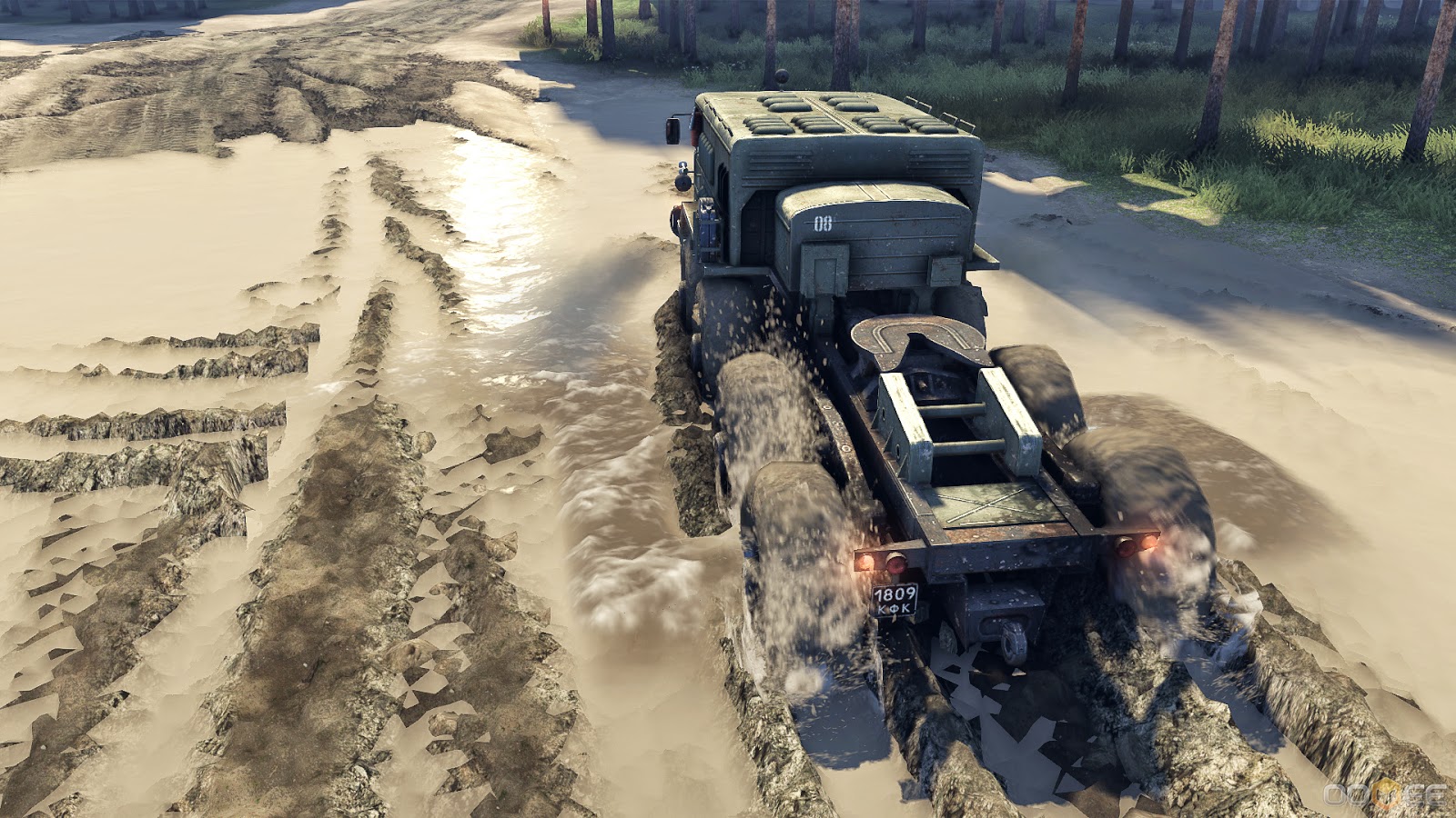
Meanwhile in Siberia...

Time to break out the winch...
With each new generation of console hardware it has become standard practice to have at least one showcase racing game in order to entice prospective buyers with improved graphic fidelity.  Xbox One has Forza Motorsports, PS4 touts the Gran Turismo series, and Wii U rounds it out with Mario Kart.  Of course there are many more titles focusing on closed course NASCAR, Formula One and Rallying, but all these games tend to focus on competing against other drivers.  Enter Spin Tires, an off road driving game wherein the completion takes the form of nature itself.

No 150cc go-kart racing in the Mushroom Kingdom here.  We're talking 38,800cc MAZ artillery-hauling trucks, designed back in 1960s Soviet Russia (built around 12 cylinder diesel engines that are only slight modified versions of what were used by the World War II era T-34 medium tank!)  There are plenty of other vehicles as well, such as the KrAZ utility transport, typically charged with carrying around large amounts of fuel, lumber, and repair equipment.  Then there is the UAZ army jeep, nicknamed the "Kozlik" (Russian for "goat") which serves as a kind of scout and pathfinder.

This thing only weights 20 tons...
What could possibly go wrong?
The level of detail on display is also quite impressive.  Unlike the clean, rigid structures of most sports cars, these monsters of the Cold War have individual components that shake and rattle while spewing forth smoke, mud and occasionally rocks that get caught up in the treads.  The low pressure tires deform over rough terrain; displacing boulders, knocking over saplings and gouging deep ruts in soft patches of earth.  Water ripples realistically when disturbed, and washes away accumulated dirt when vehicles passing through it.  The exhaust pipes even gurgle when submerged.  There's also a day/night cycle that gives the dense forests, murky ponds and swollen rivers a mysterious beauty.

Forget flashy stunts, just making it from one end of the map to the other without running out of gas, getting stuck or suffering a breakdown is an impressive accomplishing unto itself.  Spin Tires can be played multiplayer too, though the only reason to do so appears to be for co-operative reasons, since there isn't any in-game incentive to impede other players.

So what is Spin Tires?  A game for Euro Truck Simulator fans looking to get back to nature?  I'm not sure, but I do think the game's underlying design philosophy can be summed up by saying "In America you ravage nature, but in Russia nature ravages you."

Tuesday, June 17, 2014

Sagas both New and Old

I should confess right away that I'm not an expert when it comes to Norse Sagas.  However, I have read Njáls Saga, Laxdæla Saga, Ölkofra Saga and Völsunga Saga.  Normally, I'm not the kind of person to take much interest in literature written over five centuries ago about events close to millennium old, had not a humorous adaptation of the plot from Star Wars (told in the viking tradition) sparked my interest.  By all means check it out (it's called Tattúínárdǿla Saga).  In particular, I found the treatment of the prequels to be more entertaining than the actual films.  Then there is The Banner Saga which, unlike Candy Crush Saga (or pretty much any other video game with the word "saga" in the title), actually has some connection to Scandinavian folklore.  It's not perfection, but before I start to criticize, let me give this game some much deserved praise.

The art direction is beautiful.  Static as most of it is, I love the Eyvind Earle influenced stylization of the landscapes along with the character portraits and rotoscope animation that hearkens back to the glory days of Ralph Bakshi and Don Bluth.  The music is also excellent although I would have liked a bit more of it.  Then again the sparseness of musical cues suits the sober setting.  The combat mechanics are also surprisingly deep, and while I've seen a significant amount of grumbling about the counter-intuitiveness of the turn order system, I enjoy it.  The system's strengths are twofold; it nominalizes the effects of numerical superiority while simultaneously ensuring that the standard approach of focusing-on-one-target-until-it's-dead doesn't always apply.  Outside of combat there's a wealth of role-playing opportunities.  One of the annoyances about supposed morality systems in video games is their ham-handed "be good," "be evil" or "be indecisive" approach to decision making.  Thankfully, The Banner Saga avoids this pitfall for the most part by making pretty much every important set of choices come back to haunt you in some way, shape or form.  Stripped down to it's bare bones, the player's only real choice ends up being which way they'll get screwed.  Again, I think this is appropriate given the circumstances in which the characters find themselves...cynical me also thinks this is rather consistent with real life.

A number of reviewers have called the Banner Saga a mix of Oregon Trail and Final Fantasy: Tactics.  I can definitely see the similarities to the former, but the combat in particular reminds me most of Betrayal at Krondor.  If I had to choose a Japanese parallel, something from the visual novel genre seems like a closer match to me.  While we're on the topic of text driven games, I should mention that I don't like poor writing any more than listening to bad voice acting.  Luckily, the limited use of voice acting is done well here and the text is passable although strangely lacking in Ye Olde English.  Then again the Icelandic sagas (at least those translated by the awesomely named Magnus Magnusson) are in sparse modern prose, albeit somewhat more archaic in terms of expression and presentation.

So, what's my main gripe with this take on ancient Norse literature?  In a word - clothing.  Don't get me wrong, it's all very period and thematically appropriate, but in the case of the Varl, I can't figure out how they could possibly put on a pullover tunic without ripping it.  Just look at the horns on these giants!  How the heck do they get dressed without snagging one (or both) of those pointy noggin spikes on their shirt fabric.


Other than that nitpick though The Banner Saga is a great game.  Especially when you consider it was an early kickstarter project made almost entirely by three ex-Bioware employees working out of a shack somewhere in Austin, Texas.  It's cheap, it's indie, and it's easy to tell a lot passionate effort went into making the game.  In future installments I look forward to sailing longships, slaying wyrms, meeting shieldmaidens, and sending berserkers into combat (hopefully on battlefields that are more than just flat open spaces).

Monday, June 9, 2014

A Beautiful Mess

I've been introduced to the term "a beautiful mess" recently to describe video games which have interesting elements that failed to gel together into a cohesive whole.  Thinking back to titles that I've played in the recent past Banner Saga is the first that comes to mind, but I'd rather dedicate an entire post to that game at a later date.  So for now here are a few older titles that come to mind as quintessential examples.

Call of Cthulhu: Dark Corners of the Earth is one of the more recent attempts by the game industry to adapt the collective works of horror novelist H.P. Lovecraft.  Particularly the short stories "Shadow Over Innsmouth" and "Shadow out of Time" are on display here in faithful detail.  The video game also draws heavily on several table-top gaming supplementary RPG books by Chaosium to fill in some of the blanks.  True to the source material, sanity loss plays an important part in the game, as well as cosmic horror (not to mention a pinch of old fashion slasher flick gore to punctuate some of the scares).  It also tries to implement an accurate injury system which can inhibit the player controlled character in various ways if left untreated.  The problem with this title is it tries to be too many things at once.  Just to illustrate my point the genre of this game starts off walking simulator, then changes to a stealth game, followed by platforming and rail shooting.  After that there's a smattering of puzzle sections, straight up first person shooting and finally a decent into survival horror territory.  This would be great except none of the aforementioned gameplay bits are well handled...or fun really.  Lots of game crashing bugs don't help either.

Miasmata combines exploration and survival with biology and cartography.  You character is a severely ill castaway trapped on an isolated island, alone except for some birds, insects, squirrels...and a creature.  What kind of creature?  That's a good question.  It's not exactly something you can find in a zoology book.  In fact it might not be real in the strictest sense of the word.  Also, there's lots of murdered people, abandoned huts and a twist ending.  In order to survive the player will find themselves trying to keep hydrated and rested.  Mapping out the island by triangulating landmarks is important too since it's vital to the task of collecting local flora specimens to synthesize medicine and potentially a cure.  The game uses it's own original rendering engine (impressive when you consider that the development team consisted of only two people).  The cloud and water effects are particular iconic as well as the island itself, which feels like an amalgamation of several real world nature preserves, complete with ancient ruins, bamboo forests and weathered Moai.  Day and night cycles and dynamic weather add to the experience as well.  The problem with this game is the poorly optimized code, terrible sound design and general lack of polish.  Normally, this would just be a bunch of nitpicks, but all these things represent the glue that holds the entire experience together.  Hence the title fails to make a good initial impression (not to mention keeping immersion).

Demon's Souls is probably my favorite PS3 exclusive.  Hard as nails, filled with unique mechanics both on and off-line.  The story has the perfect amount of presence.  Just enough detail to get the ball rolling, but not so much it feels obtrusive, plus extra goodies for players who want to know more.  Visually, this dark fantasy title looks like it draws heavily from old-school Dungeons and Dragons artwork (actually the Fighting Fantasy series of game books).  Oppressive darkness, horrifying foes, cryptic allies, and overall feelings of desolation intertwine with demons, undead, mutations and madness.  This game freaked me out more than most horror games, and was...unforgiving to put it lightly.  Mechanics-wise though this first entry in the Souls series suffered from poor PvP, useless weapon classes (axes and crossbows in particular), not to mention two weapon fighting is impractical despite getting extensive animations.  Oh, and the dragons, giant beetles and certain bosses can only be killed by spamming incredibly awkward attacks over and over ad nauseum.  Key mechanics aren't explained anywhere and character stats are unbalanced with no way to re-spec less-than-optimal character builds.  World tendency (an online persistency mechanic affecting difficulty, the presence of certain NPCs and access to some locations) has to be actively avoided by disconnecting the PS3 from the internet in order to complete some sub-objectives as well.

Despite all my complaints I actually really enjoyed all three the above mentioned titles.  Perhaps I can overlook the flaws simply because I feel like these games offer something new.  Sure the latest triple AAA titles are more often than not polished to a high level of sheen, but I can't help having a soft spot for beautiful messes.

Monday, June 2, 2014

Persuasive Packaging

It goes without saying most triple AAA titles that come out these days have at least two distinct formats; a disk in a plastic case or a deluxe collectors edition with tons of stuff in addition to the game.  Of course a third, and increasingly common form, is digital distribution.  Back before the internet though it really came down to the box since there were only a few monthly publications that had relevant information regarding what was on store shelves.

Box art was obviously a big deal, and unlike now, where sizes have become standardized, computer games back in the day came in all sorts of rectangular shapes.  Fold out front covers were one way companies increased how many screenshots, quotes and bullet points they could display.  The quality of the packaging was also very important with embossed slipcases over heavy reinforced cardboard being the pinnacle of the design concept.  Then there were some interesting outliers such as the aptly named Shadow of the Beast, which came in a box so huge it could easily be mistaken for a board game rather than an Amiga title (apparently the extra space was need for the T-shirt included inside).  Conversely, Adventure Construction Set came in a box so slender it looked like a vinyl record case.  Thief 1 and 2 were sold in a trapezoid shaped boxes, while Day of the Tentacle tried to draw attention by hitting store shelves in a box shaped like a triangular peg.

When it comes down to what's in the box, soundtracks, art books, and plastic figurines tend to be all the rage now.  So much so these collectibles are sometimes included in pre-orders at no extra charge.  I got a copy of Dark Souls in a tin case with all the above mentioned extras for the same price as a regular copy simply because I ordered it off Amazon before the release date.  Not a bad deal really, but it was hardly my first experience with free gaming trinkets.  For that you'd have to go way back to the very first Leisure Suit Larry game and the novelty "Lefty's Bar" napkin that was included with each copy of the game.  This was hardly anything special though compared to the mainline Ultima series which had cloth maps, pendents, tarot cards, and drawstring pouches containing fantasy coinage or even metal runes.

Copy protection wheels were another common accessory.  Although these eventually gave way to looking up individual words in tome-like instruction manuals.  These packaged books (yes, books and not pamphlets) not only contained information on how to play the game, but also had extensive setting material and flavor text.  In particular, the original Heroes of Might and Magic contained a series of correspondence letters written by a traitor to his former master.  Wing Commander had a short comic, and Space Quest featured an in-fiction magazine that had articles, interviews, plus mail order advertisements for Labion Terror Beast Mating Whistles among other things (yes, you need one of those in Space Quest 2).  There was lots of history to be found, both made up (as in the case of Homeworld) and real (like the Art of War games).

Overall, most of the stuff that comes with the games themselves ends up being a bunch of shelf space wasting junk.  In defense of the GTA series though, I will say it's nicely practical that the posters included with the games have world maps printed on the backside.  What really makes me sad though is people scrambling to get crap like cheap headsets, night sight goggles or plastic helmets that are too tiny to actually wear, yet the gorgeously illuminated wizard's book for Ni no Kuni is only available as a PDF file attachment for the US version of the game.  This is especially depressing when you consider that the book is a genuinely useful piece of realia tied directly to gameplay.  I guess busts of Duke Nukem or the dismembered torso of a bikini wearing zombie in Dead Island are more marketable though, right?...*sigh*