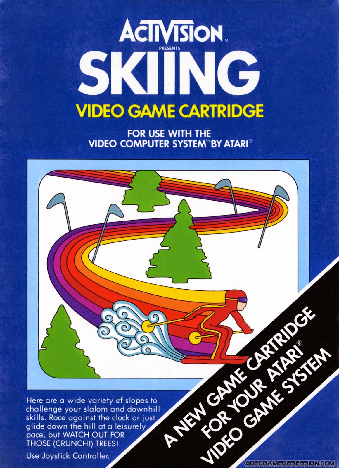
I've always had a soft spot for really old video game covers. Since Atari 2600 consoles had pretty minimal graphics the cartridge art was there to give players an idea of what they might imagine while looking at their TV screens. Of course not all box art was this way. In particular, Activision tended to go with cover artwork more indicative of the actual game. To give the impression of motion on a static picture though they liked to use rainbows. It's a more honest approach which might come as a surprised since this is Activsion we're talking about...here's some examples for your viewing enjoyment:


No comments:
Post a Comment